10 Data visualization examples: Useful ways to visualize your data

- Blog
- Data democratization
The right data visualization can give your analytic app or dashboard the punch to make it truly great.
In this article, we will cover:
Define data visualization
Data visualization is the creation of visual representations of data. These representations clearly communicate insights from data through charts and graphs. In terms of business intelligence (BI), these visualizations help users make better data-based decisions.
Data is beautiful
To create architecture is to put in order. Put what in order? Function and objects.
Le Corbusier was one of the greatest architects of the 20th Century. He intuitively understood how to reduce everything to its simplest and most elegant form without ever sacrificing what mattered most: the purpose of each creation and how people interact with the space around them.
Try Sisense with guided sample data (or your own.)
Free trial
Focusing on the function and user
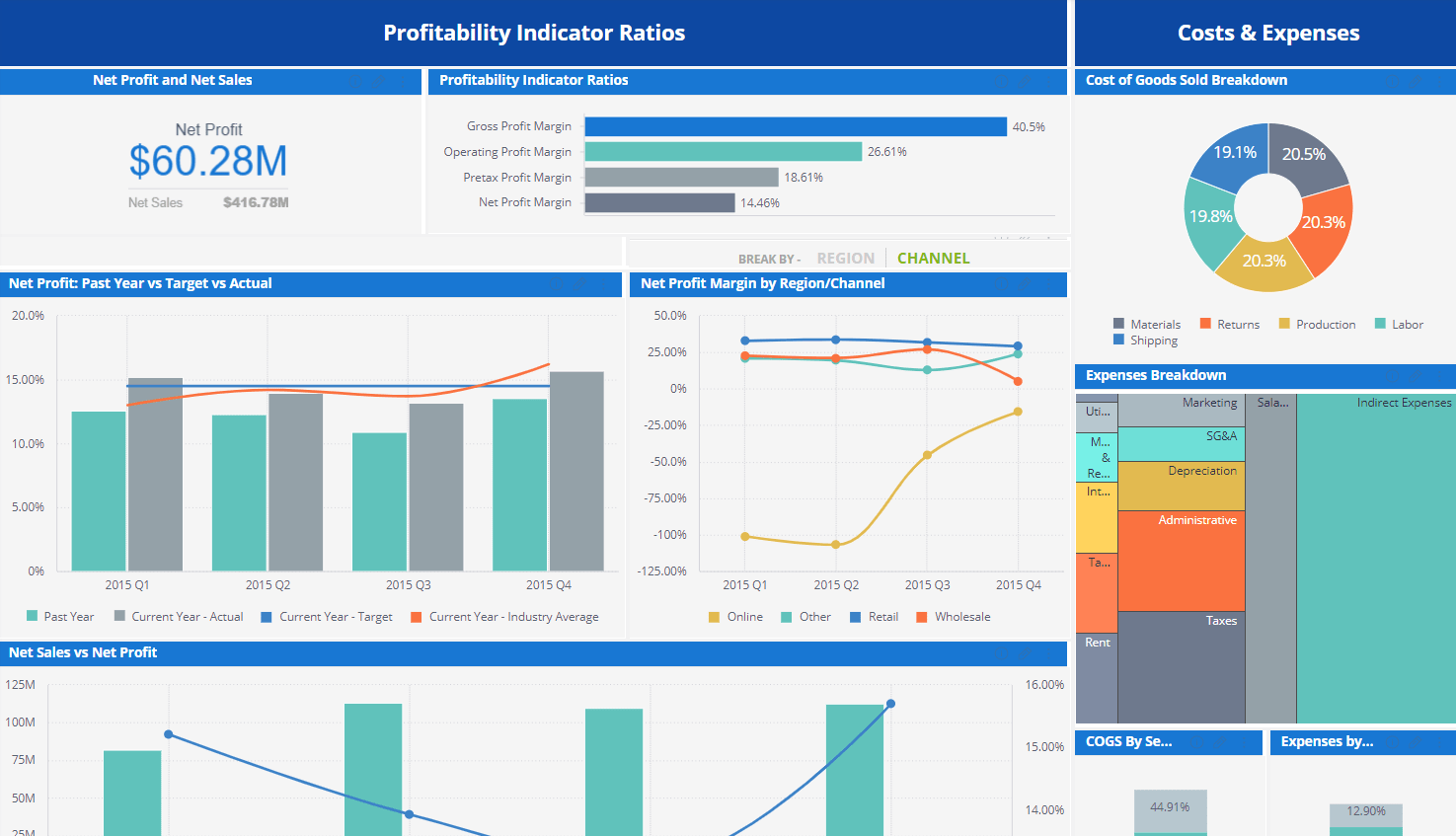
Data visualization is a lot like architecture. When figuring out how to display data, you need to start with the function—the trend, pattern, or vital piece of information you’re trying to impart at a glance—then consider the user: how they navigate and interact with the data. This is especially important in visualizing analytics, where clarity and usability are crucial for turning raw numbers into actionable insight. Only then do we reach the final step: making it as clean and beautiful as possible. Because data is beautiful.
Taking the right steps to clean data visualization
Many people tackle these steps in the wrong order. Instead of saying, “This is the information I need to present; let’s find the best possible way of showing that idea,” they think to themselves: “We need a bar chart/pie chart/indicator here.” Or worse: “Scatter maps are kind of cool. Let’s put one in here?”
This is how people end up with confusing or even misleading visualizations that, while attractive, do little to aid smart decision making or enlighten users about the true performance of their businesses.
In this article, we’ll run through 10 types of data visualization examples (plus one bonus!), ranging from the simple to the complex, explaining their unique features as well as how and when to use them for maximum impact.
10 data visualization examples
1. Indicators show one KPI, clearly
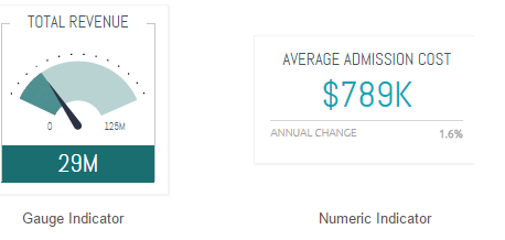
These are particularly useful when you want to give an instant idea of how well the business is doing on a particular KPI. Incorporating a simple “gauge indicator” visualization shows you immediately whether you’re above or below target, and whether you’re moving in the right direction. This is especially effective if you incorporate color-coding, like red/green coloring or up/down arrows. You can even design custom indicators and visuals to give your story a stronger punch.
A numerical indicator like the one below on the right is even more straightforward giving a simple headline figure and an indication of how it compares to the previous year/quarter/month, etc.
2. Line charts display trends
Line charts are resoundingly popular for a range of business use cases because they demonstrate an overall trend swiftly and concisely, in a way that’s hard to misinterpret. In particular, they’re good for depicting trends for different categories over the same period of time, to aid comparison. For example, this graph visualizes sales figures by age group for three different product lines:
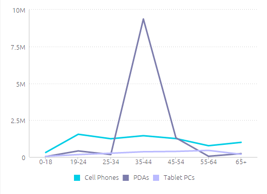
Here, you can see at a glance that your biggest customers are 34-45 year old buyers of PDAs, followed by 19-24 year old buyers of cell phones.
3. Bar charts break things down, simply
Bar charts are great for comparing several different values, especially when some of these are broken into color-coded categories. To illustrate the difference between this and a line graph, let’s now take the same information as above and revisualize it as a bar chart:
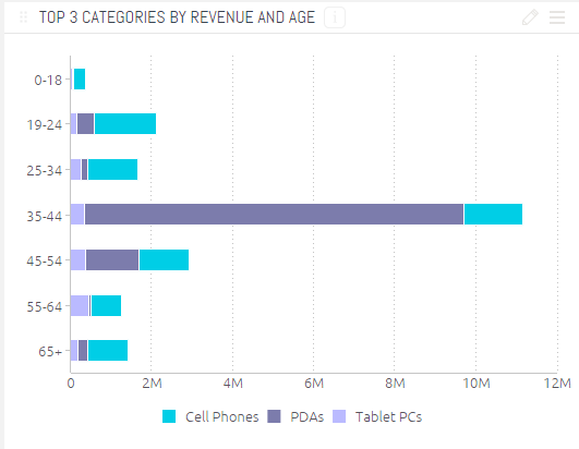
While the primary takeaway from the line chart is the huge central spike, representing PDAs bought by 34-45 year olds, here you are encouraged to take in the more granular differences between sales figures for each category within each age group. Since the different product lines are groups by age group, you can also see at a glance which age groups are the most valuable to your business, rather than focussing on the product line.
4. Column charts compare values side-by-side
Usually, it makes sense to use column charts for side-by-side comparisons of different values. You can also use them to show change over time, although it makes sense to do this when you want to draw attention to total figures rather than the shape of the trend (which is more effective with a line chart).
For example, the chart below shows total website page views vs. sessions on a series of dates. The numbers don’t move much from day to day, so a line graph wouldn’t reveal anything insightful in terms of trends; rather, the pertinent information here is the concrete number of visitors to the website each day.
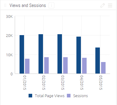
Expert move: if you want to highlight or contrast key figures and an overall trend, you can combine a line and column chart, as in the example below.
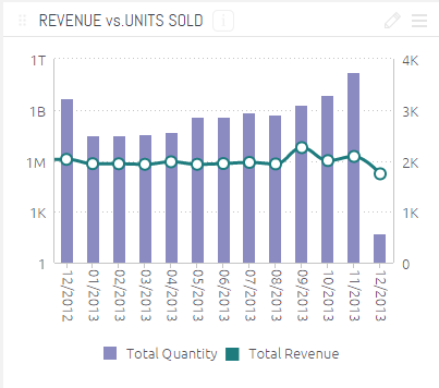
As you can see here, the total number of units sold and the total revenue for each month tell a slightly different story; the visualization actually opens up a new line of inquiry into which units are the most profitable, even when fewer are sold — which could prove key in shaping your sales and marketing strategy going forward.
Enhance your visualizations with AI-driven embedded analytics
Watch now
5. Pie charts clearly show proportions
Pie charts easily show the share each value makes up of the whole. They’re far more intuitive than simply listing percentages that add up to 100%.
This pie chart illustrates which campaigns bring in the biggest share of total leads. You see at once that AdWords is the most effective source, followed by social media and then webinar signups. An instant insight would illuminate to your marketing team what’s working best, helping them to rapidly reassign resources or refocus their efforts to maximize lead generation.

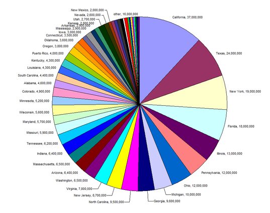
Important: for a pie chart to be effective, you need to have six categories or fewer. Any more than that and the chart will be too crowded, and the values too indistinct, to garner any insight. Check out this monstrosity, comparing population sizes of US states, as evidence of how a pie chart can communicate very little information at all:
6. Area charts compare proportions

Area charts are useful because they give a sense of the overall volume, as well as the proportion of this taken up by each category.
In the example above, you can see how much of one volume (revenue) is overlapped by another volume (cost). This is a great way to impose a reality check on your revenue estimations — you see at once that the yellow sliver of profit is at its thinnest, helping you to assess where cash flow really is tightest, rather than where in the year you’re simply bringing in the most cash.
(Important: layered visualizations like these get confusing when you introduce more than three values into the mix.)
This kind of information can illuminate issues like resource planning, ordering patterns, financial management, allocating appropriate storage space, and more.
7. Pivot table easily present key figures
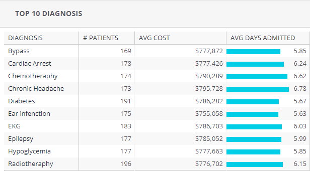
Pivot tables aren’t the most beautiful or intuitive ways to visualize data, but they are useful when you want to quickly extract key figures while seeing exact numbers (rather than get a sense of trends), especially if you don’t have access to a self-service BI tool that can automate this for you.
In this example, complex patient information is summarized to give you a detailed overview of costs, patient numbers, and average days admitted to hospital:
8. Scatter charts: distribution and relationships
Scatter charts present categories of data by circle color and the volume of the data by circle size; they’re used to visualize the distribution of, and relationship between, two variables.
The chart below visualizes each product line by the number of units sold and the revenue this brings in, representing the value in physical size. It also breaks this down by gender (hovering over the circles would reveal the name of the product in the original).
In this scenario, you can see that your most frequent (and profitable) clients are currently men — which could lead you either to focus more marketing effort on male shoppers, or to seek out more effective ways of engaging female customers, depending on your business priorities.
9. Bubble charts: understand multiple variables
Similar to scatter charts, bubble charts depict the weight of values by circle circumference size. However, they differ in that they pack many different values into one small space and only represent a single measurement per category. They are useful when you want to demonstrate how a handful of categories are highly significant compared to a sea of insignificant ones. This kind of visual storytelling can help users focus on their biggest challenges or successes, easily.
For example, take this bubble chart based on this research by the New York Times, which breaks down how the US government’s $3.7 trillion in “welfare” is actually spent:
You see immediately here that the percentage most people think of as welfare (i.e. benefits) is dwarfed in comparison to admin costs, defense-connected spending, and interest, while most outgoings wrapped into this category are so tiny they are barely visible.
While bubble charts like these are often used to make a stark political point, you can also use this to great effect in your business to demonstrate things like misplaced priorities, actual comparative costs and values, or to highlight areas of highest spending when looking to streamline activities and cut costs.
10. Treemaps display hierarchies, compare values
Treemaps are useful for displaying hierarchies and comparative value between categories and subcategories, as well as allowing you to retain detail while projecting an instant sense of which areas are most important overall.
You achieve this by nesting color-coded rectangles inside each other, weighted to reflect their share of the whole. This treemap depicts the value of different marketing channels, which are then broken down by country. You see at a glance that AdWords is your most successful channel, but that the US is your most valuable destination, across all channels.
11. Polar charts show relationships between multiple variables
A polar chart (or polar area diagram) is a type of pie chart. However, instead of depicting each value’s share of the whole by the size of the angle, all the sectors have equal angles, and the value is shown by how far it reaches from the center of the circle.
The example below is from a sales dashboard depicting sales of multiple brands. Each segment represents a brand name, while red represents new products, light gray represents refurbished products, and dark gray means “unspecified.”
12. Area/scatter maps show geographic data
These data visualizations allow you to see immediately which geographical locations are most significant to your business. Data is visualized as points of color on a map; values are represented by circle size.
For example, the map below depicts website visitors by location, while the color indicates the percentage of conversions (the brighter the green, the higher the conversion rate).
This kind of representation is incredibly useful as it gives two vital pieces of information at a glance: where in the world most of your visitors are from, compared to where in the world your most valuable visitors are from. Insights like these can show weaknesses in a marketing strategy in seconds.
13. Funnel charts display a pipeline, typically for sales figures
This is a very specific type of visualization that depicts the decreasing values as customers move through the sales funnel. The beauty of it is that it brings your conversation rates to life at each step, so you can see quickly where people are dropping out of the process. The funnel chart below shows the number of people at each demand stage, from initial website visit, through every touchpoint until a final sale:
14. For advanced users: Fisheye/Cartesian distortion to zoom in on details
Finally, this isn’t a data visualization style per se, but rather a useful addition that allows you to zoom into the details in a more complex visualization, like a force-directed graph or bubble chart. As you move your cursor over a graph, the area you’re seeing expands in fisheye view, allowing you to dip in and out to see more granular details as needed. Take a look at how it works here.
Why customers rate Sisense higher than Power BI, Qlik, and ThoughtSpot
Read now
Bolder visualizations, better decisions
Whichever type of data visualization you opt for, remember that to make it accurate and effective, the software you use must be able to interact effectively with your data.
Your data visualization software should be able to handle whichever data sources you throw at it. You must be able to clean and prepare your data properly.
You should be able to incorporate a powerful external visualization tool like D3 to enhance your results. Without a powerful, flexible platform, you could end up creating a beautiful structure … but on very shaky foundations.
Jack Cieslak is a 10-year veteran of the tech world. He’s written for Amazon, CB Insights, and others, on topics ranging from ecommerce and VC investments to crazy product launches and top-secret startup projects.

Subscribe to the Sisense newsletter
Get monthly insights on building smarter products with AI-powered analytics, from industry trends to real Sisense use cases.


