Dashboard design best practices – 4 key principles

- Blog
- Analytics Platform as a Service (AnPaaS)
- Data democratization
- Embedded Analytics
- Poor Design Choices
- 1. 5 Second Rule
- 2. Logical Layout
- 3. Minimalism
- 4. Choosing Data Visualization
- What Else to Consider
Building an effective dashboard according to best practices for dashboard design is the culmination of a comprehensive BI process that would usually include gathering requirements, defining KPIs, and creating a data model.
However, the importance of proper dashboard design should not be understated — poorly designed dashboards could fail to convey useful information and insights and even make the data less comprehensible than it was originally.
A great design is one that:
- Makes the complex simple: we have lots of information, lots of data that changes all the time and different analytical needs and questions. We want to take all this complexity and make it simple.
- Tells a clear story: we want to be able to connect data to its context in the business and to answer the viewer’s questions. This is where the visual layout of a dashboard plays a crucial role.
- Expresses the meaning of the data: the chosen data visualizations need to correctly represent the data and the information you want to extract from it.
- Reveals details as needed: we want each viewer to have access to the data they need — no less but also no more. Some users might need to be able to see a more granular view of the data — others could suffice with an overview.
While each data dashboard has its own requirements, limitations, and goals, there are certain guidelines that are almost always relevant for dashboard creation. This is especially true as AI-powered dashboards become more common, offering dynamic insights, automated alerts, and predictive capabilities. We will proceed to present four of these principles, and how you can start applying them to your dashboards right now.
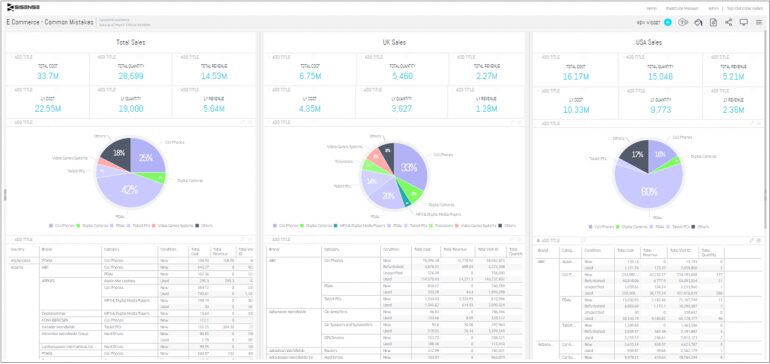
First, let’s examine how a poorly designed dashboard might look:

Click to enlarge
Which poor design choices are immediately noticeable?
- Too many widgets (about 30 of them) create visual clutter
- Basic questions such as “what is the total amount of sales?” take much more than 5 seconds to answer
- No organizing principle behind the visual layout — widgets seem to be strewn randomly
- Tables in the bottom add very little in the way of insights
By applying the following good dashboard design principles, this dashboard could have been improved dramatically.
1. The 5 Second Rule
Your dashboard should provide the relevant information in about 5 seconds.
Your dashboard should be able to answer your most frequently asked business questions at a glance. This means that if you’re scanning the information for minutes, this could indicate a problem with your dashboard’s visual layout.
When designing a dashboard, try to follow the five-second rule — this is the amount of time you or the relevant stakeholder should need to find the information you’re looking for upon examining the dashboard. Of course, ad hoc investigation will obviously take longer; but the most important metrics, the ones that are most frequently needed for the dashboard user during her workday, should immediately pop from the screen.
2. Logical Layout: the Inverted Pyramid
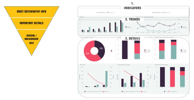
Display the most significant insights on the top part of the dashboard, trends in the middle, and granular details in the bottom.
When designing a dashboard, it’s important to follow some kind of organizing principle. One of the most useful ones is the inverted pyramid (see image). This concept originated from the world of journalism, and basically divides the contents of a news report into three, in order of diminishing significance: the most important and substantial information is at the top, followed by the significant details that help you understand the overview above them; and at the bottom you have general and background information, which will contain much more detail and allow the reader or viewer to dive deeper (think of the headline, subheading, and body of a news story).
How does a journalistic technique relate to dashboard design? Well, business intelligence dashboards, like news items, are all about telling a story. The story your dashboard tells should follow the same internal logic: keep the most significant and high-level insights at the top, the trends, which give context to these insights, underneath them, and the higher granularity details that you can then drill into and explore further at the bottom.

3. Minimalism: Less Is More
Each dashboard should contain no more than 5-9 visualizations.
Some dashboard designers feel the need to cram as many details as possible into their dashboard in an effort to provide a fuller picture. While this might sound good in theory, cognitive psychology tells us that the human brain can only comprehend around 7+-2 images in one time — this is the number of items you want in your dashboard. More than that just translates into clutter and visual noise that distracts and detracts from the dashboard’s intended purpose.
You can avoid visual clutter by using filters and hierarchies (e.g. instead of having one indicator for amount of sales in North America and one for South America, give the user the option to apply a filter which changes the same indicator between one and the other) — or simply by breaking your dashboard into two or more separate dashboards.
4. Choosing the Right Data Visualization
Select the appropriate type of data visualization according to its purpose.
We’ve written before about ways to visualize data so I won’t go into too much detail here — suffice to say that data visualization is intended to be more than mere eye candy — they should serve a specific purpose and convey specific facts in a more effective way than the basic tabular format.
Before choosing a visualization, consider which type of information you are trying to relay:
- Relationship: connection between two or more variables
- Comparison: compare two or more variables side by side
- Composition: breaking data into separate components
- Distribution: range and grouping of values within data
Dashboard Design: What Else to Consider
Choosing the right visualization is key to making sure your end-users understand what they’re looking at, but that’s not all you should consider. When thinking about how to design a dashboard, you need to also take into account who will be the end-user of the dashboard in the first place.
For example, when designing a dashboard for an end user-focused on ad platform optimization, you probably want to focus your widgets on metrics that will increase conversion rates. Because your end user is in the thick of what goes on with every ad on a day-to-day level, looking at the nitty-gritty measures such as CPM (cost per mille) makes a lot of sense. However, a VP of Marketing probably just wants to see, at first glance, the more broad strokes on how ad performance changes leads brought in. Similarly, an e-commerce dashboard for a store manager might prioritize real-time sales, stock levels, and cart abandonment rates, while an executive-level version could highlight overall revenue trends, customer lifetime value, and return on ad spend across regions.
To that end, as we mentioned earlier, before diving headfirst into dashboard design, sit with your end-users in order to gather requirements and define KPIs. Without doing that, you can design the most beautiful dashboard in the world, but it won’t change the way users make decisions in the long run.

Subscribe to the Sisense newsletter
Get monthly insights on building smarter products with AI-powered analytics, from industry trends to real Sisense use cases.


