Data visualization and visual analytics: Seeing the world of data

- Blog
- Analytics Platform as a Service (AnPaaS)
- Data democratization
- Developer experience (DevX)
- Visual analytics & data visualization definitions
- Analytics and visualizations, the key to data-driven organizations
- The role of visualizations in analytics
- Visualizations: past, present, and future
- Using visualizations to make smarter decisions
- Visual analytics and data visualizations in action
Everyone wants to get more out of their data, but how exactly to do that can leave you scratching your head. Our BI Best Practices demystify the analytics world and empower you with actionable how-to guidance.
In a world increasingly dominated by data, users of all kinds are gathering, managing, visualizing, and analyzing data in a wide variety of ways. One of the downsides of the role that data now plays in the modern business world is that users can be overloaded with jargon and tech-speak, which can be overwhelming.
Data visualization and visual analytics are two terms that come up a lot when new and experienced analytics users alike delve into the world of data in their quest to make smarter decisions. In this post, we’ll dig into what these concepts are, their strengths, and how they work together.
Data visualization: painting a picture of your data
Simply put, data visualization means showing data in a visual format that makes insights easier to understand for human users. Data is usually visualized in a pictorial or graphical form such as charts, graphs, lists, maps, and comprehensive dashboards that combine these multiple formats.
The primary objective of data visualization is to clearly communicate what the data says, help explain trends and statistics, and show patterns that would otherwise be impossible to see. Data visualization is used to make the consuming, interpreting, and understanding data as simple as possible, and to make it easier to derive insights from data. When BI and analytics users want to see analytics results, and learn from them quickly, they rely on data visualizations.
Visual analytics does the “heavy lifting” with data, by using a variety of processes — mechanical, algorithms, machine learning, natural language processing, etc — to identify and reveal patterns and trends. It prepares the data for the process of data visualization, thereby enabling users to examine data, understand what it means, interpret the patterns it highlights, and help them find meaning and gain useful insights from complex data sets.
Analytics and visualizations, the key to data-driven organizations
The relationship between data visualization and visual analytics is symbiotic. In a study for the US Department of Homeland Security, James J. Thomas, and Kristin A. Cook illustrate this relationship in what they describe as “The Sense-Making Loop” of the analytical reasoning process:

The Sense-Making Loop: The analytical reasoning process
Good data visualization enables visual analytics to be more effective and to show users better insights and better insights make for more compelling visualizations. Combining the two into visual data analysis makes it easier for users to better understand their data. Together, they help organizations and individuals identify how they can be more efficient, drive revenue, and gain a competitive advantage over their competitors.
The role of visualizations in analytics
Data visualization can either be static or interactive. Static visualizations provide users with a single view of what’s in front of them. Interactive visualizations enable users to drill down into data and extract and examine various views of the same dataset, selecting specific data points that they want to see in a visualized format.
Data visualization is what provides clarity to data-driven insights and it’s what enhances understanding throughout an organization.

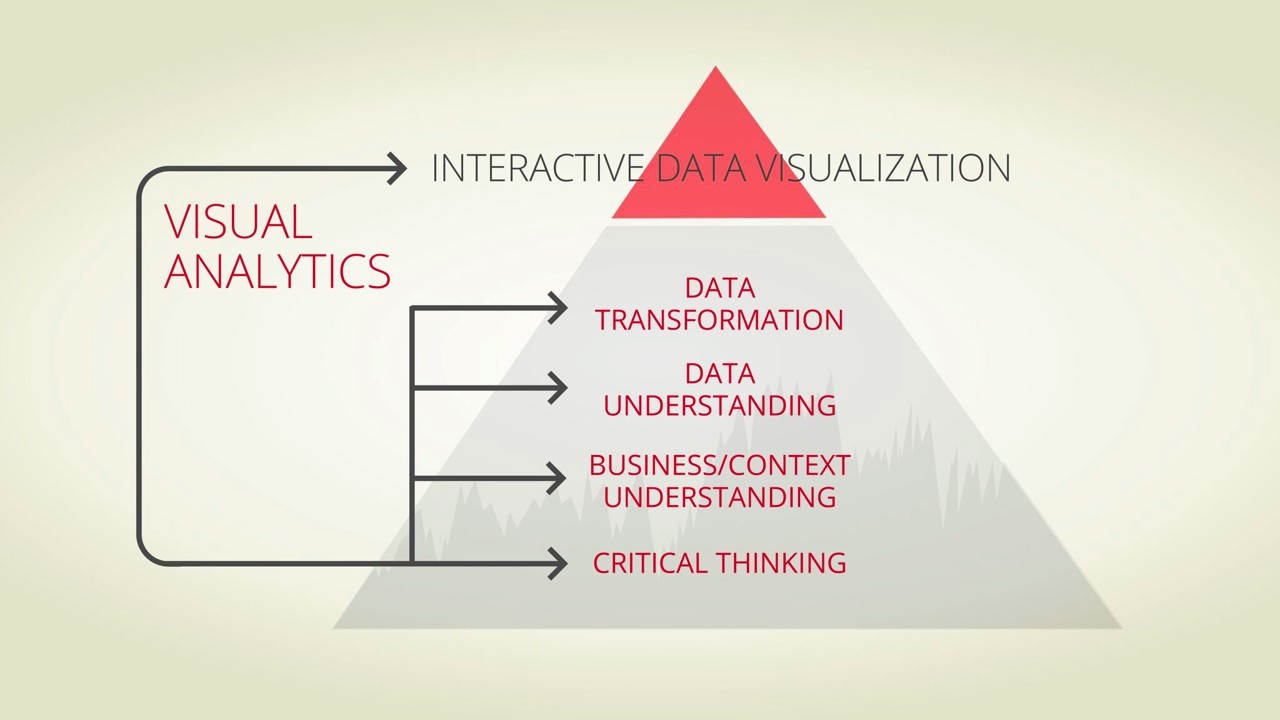
In this diagram, visual analytics is shown to be the foundation for interactive data, thereby demonstrating how the two are connected. Analytics acts as the source for data visualization and contributes to the health of any organization by identifying underlying models and patterns and predicting needs.
Visualizations: past, present, and future
Broadly, there are three types of analytics: descriptive, prescriptive, and predictive. The simplest type, descriptive analytics, describes something that has already happened and suggests its root causes.
Prescriptive analytics takes things a stage further: In addition to helping organizations understand causes, it helps them learn from what’s happened and shape tactics and strategies that can improve their current performance and their profitability. A simple example would be the analysis of marketing campaigns.
Predictive analytics is the most beneficial, but arguably the most complex type. It helps users to identify patterns that suggest future situations and behaviors. Using predictive analytics, organizations can plan for forthcoming scenarios, anticipate new trends, and prepare for them most efficiently and cost-effectively. Predicting forthcoming trends sets the stage for optimizing the benefits your organization takes from them.
Using visualizations to make smarter decisions
The data drawn from power visualizations comes from a variety of sources: Structured data, in the form of relational databases such as Excel, or unstructured data, deriving from text, video, audio, photos, the internet and smart devices. This data is gathered into either on-premises servers or increasingly into cloud data warehouses and data lakes. They are transformed into data visualizations and shared via dashboards and analytic apps so that users can make smarter, data-driven decisions.
Data teams and business and analytics teams are tasked with choosing and developing the best way to visualize data and to design well-organized dashboards in order to help end-users make smarter decisions. Dashboards need to be clear, quick to interpret, and easy to drill into to find the deeper insights when needed.
To achieve this successfully, you need a data and analytics platform that offers a powerful combination of visual analytics and data visualizations; with the capacity to handle huge volumes of data either stored on-premises, in the Cloud, or both; with the flexibility to integrate data from any source; and with the scalability for future growth.
To achieve this successfully, you need a data and analytics platform that offers a powerful combination of visual analytics and data visualization; with the capacity to handle huge volumes of data either stored on-premises, in the Cloud, or both; with the flexibility to integrate data from any source; and with the scalability for future growth.
Visual analytics and data visualizations in action
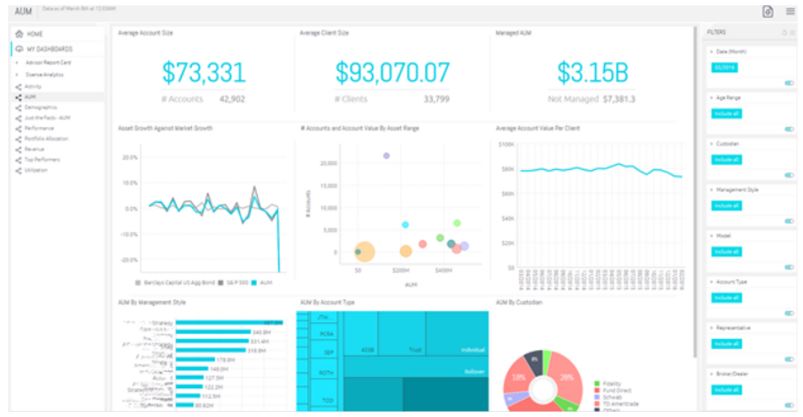
Orion is a premier portfolio accounting SaaS provider for financial advisors. Previously, they had been using a static reporting solution that served up stale news with a time lag of weeks, while their customers wanted pre-configured, dynamic dashboards. By switching to Sisense, they were able to offer all of this, doubling sales revenue at the same time.

And in the fight against COVID-19, Resconsortium has used Sisense technology to map the spread of the virus across the UK on a dashboard. It provides local and regional National Health Service capacity planners with the real-time information they need to target resources to areas where the outbreak becomes more severe or where there is a higher density of at-risk patients. And the data is as granular as the patient lists at individual family doctors’ surgeries.

To get the best insights from your data, and to optimize the benefits from your BI and analytics, you need a seamless combination of visual analytics and data visualization. Both are important, but each can’t be as effective without the other. Together, they play a vital role in the analysis and understanding of your data, and your ability to shape a successful future strategy for your organization using the insights that they reveal.
Julie Zuckerman is a senior product marketing director at Sisense, bringing over two decades of experience in marketing and product marketing at tech companies. Her debut novel, The Book of Jeremiah, was published in 2019.

Subscribe to the Sisense newsletter
Get monthly insights on building smarter products with AI-powered analytics, from industry trends to real Sisense use cases.


