Data Visualizations in Python and R

- Blog
- Advanced Analytics
- Builder Education
- Next-Level Moves
- Tech Talk
- Unlock Complex Data
Learn to use Python and R to create visualizations and better understand your data.
- What are data visualizations
- Different types of exploratory data analysis
- Data Visualization in Python
- Data Visualization in R
As datasets become bigger and more complex, only AI, materialized views, and more sophisticated coding languages will be able to glean insights from them. In Next-Level Moves, we dig into the ways advanced analytics are paving the way for the next wave of innovation.
The human brain processes visual data better than any other kind of data, which is good because about 90% of the information our brains process is visual. Visual processing and responses both occur more quickly compared to other stimuli. Ever wonder why you can pick out detail in an image with ease while staring at spreadsheets makes your head hurt? The brain processes data in visuals or images faster than data in text or rows of numbers.
You’re probably tired of hearing that information is proliferating at a rate that humans can barely comprehend, let alone keep up with. The good news is, you don’t have to! Machine learning and advanced analytics are helping humans make sense of large amounts of structured and unstructured data by leaning into our natural ability to make a better sense of visuals than the raw data we want to understand. This where the power of visualizations is apparent.
Both Python and R are advanced coding languages that can produce beautiful images that allow humans to understand vast datasets with ease. In this article, we’ll look at the ways both languages do it and give you some code you can use to create visuals of your own!
What are data visualizations?
Simply put, data visualizations allow humans to explore data in many different ways and see patterns and insights that would not be possible when looking at the raw form. Humans crave narrative and visualizations allow us to pull a story out of our stores of data.
The phrase “A picture is worth a thousand words” is expressly true when turning huge piles of data into images a viewer can actually understand and derive meaning from. Children’s storybooks contain lots of images, but very few words. As kids, we don’t know many words, but the visuals allow us to easily understand the story.
In our modern digital world, we have huge amounts of data all around us. Data scientists and ML engineers get most of the data they deal with data in a structured or unstructured data format, however, it’s difficult for humans to understand and analyze this. Data visualizations (or graphical representations of data) are vital for understanding the data. They help users explore data through visual elements like charts, graphs, plots, maps, and other visualizations.
Different types of exploratory data analysis
In every dataset, we have many variables (also called features, input-variables, or independent-variables) and target/output variables (also known as labels, dependent-variables, classes, or class-labels). The data scientist’s job is to completely understand each feature individually and the relationship between different features. The goal is to get ready the dataset for ML algorithms implementation.
We have three methods for exploratory data analysis:
Univariate analysis
In the univariate analysis, each variable is analyzed individually. It will get us to the complete statistical data for each feature. There are a variety of data visualization techniques for univariate analysis, including Box Plot, Histogram, PDF, CDF
Bivariate analysis
Bivariate analysis is performed to find the relationship between each feature with the target variable. Data visualization techniques for bivariate analysis are Scatter Plot and Heatmap
Multivariate Analysis
As the name signifies, multivariate analysis is performed to understand the relationship between different features of the dataset. One of the main multivariate analysis data visualization techniques is the Pair Plot.
We’ll discuss all these visualization techniques in detail in the next section.
Data Visualization in Python
There are a wide array of libraries you can use to create Python data visualizations, including Matplotlib, seaborn, Plotly, and others. A Python data visualization helps a user understand data in a variety of ways: Distribution, mean, median, outlier, skewness, correlation, and spread measurements. In order to see what you can do with a Python visualization, let’s try some on a dataset.
Creating Python visualizations
Let’s take a toy dataset featuring data on iris flowers to understand data visualizations in depth. The data set consists of 50 samples from each of the three species of Iris Flower: Setosa, Virginica, and Versicolor. Here “Species” is target variable and it has 4 features “Sepal Length,” “Sepal Width,” “Petal Length,” and “Petal Width.”
Import Libraries
First import basic libraries like numpy and pandas and Python data visualization libraries like matplotlib and seaborn.
import pandas as pd
import numpy as np
import matplotlib.pyplot as plt
import seaborn as sns
Understanding the Dataset
Next, load the data set from sklearn libraries:
from sklearn.datasets import load_iris
iris = load_iris()
Convert this dataset into a data frame and here are the top 5 rows with 4 features (Sepal Length, Sepal Width, Petal Length, Petal width) and one target variable (Species).
| Sepal Length | Sepal Width | Petal Length | Petal Width | Species | |
| 0 | 5.1 | 3.5 | 1.4 | 0.2 | setosa |
| 1 | 4.9 | 3 | 1.4 | 0.2 | setosa |
| 2 | 4.7 | 3.2 | 1.3 | 0.2 | setosa |
| 3 | 4.6 | 3.1 | 1.5 | 0.2 | setosa |
| 4 | 5 | 3.6 | 1.4 | 0.2 | setosa |
Here’s the code for that:
print(data.shape) #print number of rows and columns
>(150, 5)
print(data['Species'].value_counts()) # Counts of every unique Species value
> virginica 50
versicolor 50
setosa 50
Name: Species, dtype: int64
Observations: From the above outputs we can see, there are a total of 150 data points and data is distributed among 3 species equally. So, we can say this is a balanced dataset.
Bar Plot
A bar plot is a plot that presents categorical data with rectangular bars. The length or height of bars is proportional to the frequency of the category. We can count the values of various categories using bar plots.
Here, we are plotting the frequency of the three species in the Iris Dataset.
sns.countplot('Species',data=data)
plt.title('Bar Plot for 3 Species')
plt.show()
Observations:
- All bars are of the same height as we know their frequencies are equal.
- Iris Dataset is a balanced dataset.
Pie Chart
Pie Chart is a circular chart that uses pie slices to show the relative size of data. The arc length of each pie slice is proportional to the quantity it represents. It works beautifully on categorical values. There are different variants of pie charts available.
We can use this code to plot a pie chart for 3 species of Iris flower:
data['Species'].value_counts().plot.pie(explode=[0.05,0.05,0.05],autopct='%1.1f%%',shadow=True,figsize=(8,8))
plt.title("Pie chart of Species")
plt.show()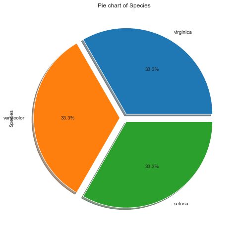
Observations:
- All three flowers are equal in proportion i.e. 33% each.
- Balanced and imbalanced datasets can be easily classified using a pie chart.
Box-plot
Box-plot gives us a five-number summary of any variable: the minimum, maximum, the sample median, the first and third quartile. Box-plot helps in measuring two observations:
1. Skewness of distribution
2. Outliers (Outliers comes outside the box-plot)
sns.boxplot(x='Petal Length', data=data)
plt.title('Boxplot of Petal Length')
plt.show()
Observations: With the above box-plot visualization we can measure the following parameters:
- The minimum is 1.0
- The maximum is 6.9
- The range is Maximum – Minimum = 5.9
- The sample median is 4.3
- The first quartile Q1 is 1.6
- The third quartile Q3 is 5.1
- The IQR(Interquartile range) is Q3-Q1= 3.5
- The mean value will be between 3.5 to 4.
- There is no outlier in this box-plot
- Petal Length is left-skewed.
We can also draw a box-plot for ‘Petal Length’ for all three different species in a single plot.
sns.boxplot(x='Species',y='Petal Length', data=data)
plt.title('Boxplot of Petal Length for 3 Species')
plt.show()
Observations:
- Petal Length of Setosia is the smallest of all three.
- Virginica has the largest petal length.
- There is an outlier in Versicolor.
Similarly, we can draw box-plots for other features as well.
Histogram and PDF
A histogram is a graphical representation of the distribution of numerical data. It is an estimate of the probability distribution of a continuous variable. Histogram basically represents the number of points that exist for each bin(range of values). PDF is a Probability Density Function which is basically smoothening of the histogram.
sns.FacetGrid(data, hue="Species", size=5)
   .map(sns.distplot, "Petal Length")
   .add_legend();
plt.title('Histogram and PDF of Petal Length')
plt.show();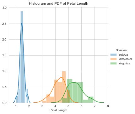
Observations:
In the above graph, lines which are drawn are PDF and Bars drawn is a histogram. From the above graph, we can simply write if-else statements like:
If Petal Length 5.8 then flower species is Verginica else- if 2.3So, probability can be easily calculated using these if-else statements that’s why this graph is called probability density function.
- Setosa is easily separable on the basis of Petal Length.
- There is an overlap between Versicolor and Virginia.
- Distributions are Uniform/Gaussian distribution.
CDF (Cumulative Density Function)
As the name signifies, the cumulative distribution function gives you the cumulative probability associated with a variable. It is the total count up to a certain number. CDF is always in increasing order
data_cdf=data[data['Species']=='setosa']
counts, bin_edges = np.histogram(data_cdf['Petal Length'], bins=10, density = True)
pdf = counts/(sum(counts))
cdf = np.cumsum(pdf)
plt.plot(bin_edges[1:],pdf)
plt.plot(bin_edges[1:], cdf)
plt.xlabel("Petal Length")
plt.ylabel("Probability")
plt.title('PDF and CDF for Petal Length for Setosa')
Observations:
In the above graph, the Blue line is PDF and the Orange line is CDF.
- From CDF it is easy to calculate percentages like approximately 90% of Setosa flowers have Petal Length less than 1.7 which can not be calculated using PDF.
- Approx 50% of setosa flowers have Petal Length less than 1.5
Scatter Plots
A scatter plot is a plot that shows the relationship between two variables of a data set.
data.plot(kind='scatter', x='Sepal Length', y='Sepal Width') ;
plt.title("Scatter plot of Sepal Length and Sepal Width")
plt.show()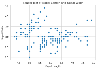
Observations:
In the above plot, we cannot differentiate different flowers, all points are in the same color.
sns.set_style("whitegrid");
sns.FacetGrid(data, hue="Species", size=4)
   .map(plt.scatter, "Sepal Length", "Sepal Width")
   .add_legend();
plt.title("Scatter plot of Sepal Length and Sepal Width")
plt.show();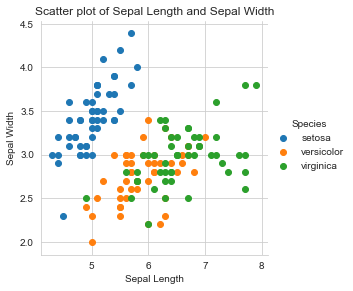
Observations:
- Setosa (blue) is easily differentiable
- Versicolor and virginica overlap in Sepal Length and Sepal Width as well. They are not easily separable.
Heat Map
A heatmap is a graphical representation of data in which data values are represented as colors. It uses color in order to communicate the correlation between two variables. Values are between -1 to 1. 1 denotes perfect positive correlation. 0 means no correlation and -1 means the highest negative correlation.
Let’s plot a heat map for the Iris dataset.
sns.heatmap(data.corr(),annot=True)
Observations:
- Petal Length and Petal Width shows highest positive correlation 0.96
- Petal Length shows a high positive correlation of 0.87 with Sepal Length as well.
- Petal Width shows a high positive correlation of 0.82 with Sepal Length as well.
- Petal Length and Sepal Width shows a negative correlation of -0.43
- Sepal Width shows a negative correlation with the other 3 features.
Line chart
The line chart represents a series of data points connected by a straight line. It is generally used to visualize data that changes over time. Here, we will draw a line chart showing how Petal Width changes with change in Petal Length.
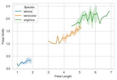
Observations:
- Large Petal Length means Large Petal Width
- The line chart is not straight-line; it’s fluctuating.
- Small Petal Length means Small Petal Width
Word Cloud
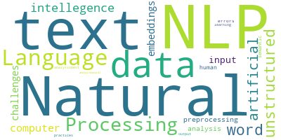
Word cloud is an image made up of words that makes a quick visualization. The size of the word shows the frequency of the word in text data. The word which is biggest in size has the highest frequency in text data.
Data Visualization in R
R is extremely easy and flexible to use with minimum code to create visualizations. R has a wide array of libraries you can use to create beautiful data visualizations, including ggplot2, Plotly, and others. In order to see what you can do with R visualization, let’s try some visualizations on the same toy dataset.
Import libraries
First, import data visualization library ggplot2 and in-built datasets library datasets.
library(ggplot2)
library(datasets)
Understanding the Dataset with R
Next, load the in-built iris data set from the library and analyze the data.
data(iris)
head(iris)
Here are the top 6 rows in the iris dataset with 4 features (Sepal.Length, Sepal.Width, Petal.Length, Petal.width) and one target variable (Species).
| Sepal.Length | Sepal.Width | Petal.Length | Petal.Width | Species | |
| 1 | 5.1 | 3.5 | 1.4 | 0.2 | setosa |
| 2 | 4.9 | 3 | 1.4 | 0.2 | setosa |
| 3 | 4.7 | 3.2 | 1.3 | 0.2 | setosa |
| 4 | 4.6 | 3.1 | 1.5 | 0.2 | setosa |
| 5 | 5 | 3.6 | 1.4 | 0.2 | setosa |
| 6 | 5.4 | 3.9 | 1.7 | 0.4 | setosa |
Here’s the code for that:
dim(iris) #print number of rows and columns
>(150, 5)

levels(iris$Species) # Display unique Species value
> [1] "setosa"     "versicolor" "virginica"

table(iris$Species)
> setosa versicolor  virginica
      50         50         50
Observations: From the above outputs, we can see there are a total of 150 data points and data is distributed among 3 species equally. So, we can say this is a balanced dataset.
Box-plot
Like we see in Python box plots, in R as well Box-plot helps in measuring two observations:
1. Skewness of distribution
2. Outliers (outliers fall outside the box-plot)
We have drawn box-plot for ‘Petal Width’ for all three different species in a single plot.
ggplot(iris, aes(Species, Petal.Width, fill=Species)) + geom_boxplot()+ labs(title = "Box Plot for Iris Petal Width for all Species ", x = "Species"
Observations:
- Petal Width of Setosa is the smallest of all three.
- Virginica has the largest petal width.
- There are outliers in Setosa.
- Petal Width is left-skewed.
Histogram
You can use the R code below to draw a histogram for Petal Length to find out the number of points that exist for each bin (range of values):
ggplot(data=iris, aes(x=Petal.Length))+
  geom_histogram(binwidth=0.2, color="black", aes(fill=Species))+
  xlab("Petal Length") +
  ylab("Frequency") +
  ggtitle("Histogram of Petal Length")
Observations:
The bars in the above graph compose a histogram. The observations drawn here are the same as the ones we drew from the histogram in Python:
- Setosa is easily separable on the basis of Petal Length.
- There is an overlap between Versicolor and Virginia.
- Distributions are Uniform/Gaussian distribution.
Scatter Plots
A scatter plot is a plot that shows the relationship between two variables of a data set. You can draw a scatter plot between Petal Length and Petal Width for all three species in R with this code:
ggplot(data = iris, aes(x = Petal.Length, y = Petal.Width))+
  xlab("Petal Length")+
  ylab("Petal Width") +
  geom_point(aes(color = Species,shape=Species),size = 2)+
  ggtitle("Petal Length vs Petal Width scatter plot")

Observations:
- Setosa (red) is easily differentiable
- Versicolor and virginica overlap slightly in Petal Length and Petal Width. These two can almost distinguish using Petal Length and Petal Width
Picturing the possibilities of data visualizations
In our modern world of Big Data, data visualizations are necessary. They can literally give direction and a vision to data scientists and frontline business users alike. This article just gives you a sampling of the various visualizations you can create in Python and R and the code to get started.
Hopefully, you found these easy to understand and implement. The ways in which data can be visualized are endless, this is just a start. Both Python visualizations and R visualizations give you a wealth of options to explore. Just grab your data and start experimenting. You’ll be amazed with the beautiful, informative imagery you can create.
Scott Castle is the VP of Strategy at Sisense. He brings over 25 years of experience in software development and product management at leading technology companies including Adobe, Electric Cloud, and FileNet. Scott is a prolific writer and speaker on all things data, appearing at events like the Gartner Enterprise Data Conference, Data Champions, and Strata Data NYC.


